Between this flu thing going around and my back being out I just haven't been up to drawing these past couple of weeks but I am getting better and should be able to finish this eye tutorial pretty soon.
Then I will be starting my large Abe Lincoln portrait which will be a very long term project. I will post updates to that and more tutorials here as time permits.
Skip
Wednesday, January 16, 2013
Sunday, January 6, 2013
Drawing a Realistic Eye Tutorial Part 2 - Shape and Shading
This is the second part of the eye tutorial that deals with adding shape to your drawing with shading. This video will show how much of an impact adding shading to your drawing will have. Shading is what gives your image depth and character. Plus it is essential for drawing something that has a realistic three dimensional look to it.
I have exaggerated some of the shading to some extent to make an example but for the most part this is a pretty good example for you to see. There are no new techniques to speak of here so I will not be adding captions in the video to describe what I am doing.
I used pretty much all of my mechanical pencils (from 6H to B - both .3mm and .5mm) so I won't list them. When drawing, I don't believe that it is important which lead you use as long as you get the desired tone. Some people can use an HB lead and get very dark results while others need to use 4B to get the same tone.
Another thing to consider is using a soft lead and using a very light touch will give you a very grainy look. This is because you will not be pushing the graphite deep into the tooth of the paper so the white will show through. Conversely, pushing hard on the pencil will produce a smoother look as you are driving the graphite deep into the paper. For areas like skin it produces a more realistic look if you use a harder lead and press hard for a smooth texture. In this tutorial I showed you how to draw a "rougher" texture to simulate the look of skin. This can be a very personal choice as some like the look of a much smoother texture for their skin. However, if you add some kind of texture it will have a more realistic look. If you look at skin very closely you will see that it is actually has quite a bit of texture to it. The problem with adding too much texture is that it can make the person you are drawing look older so be careful!

Here's a comparison of how much of a difference shading makes.
Next time I will actually draw the eye of this eye tutorial!
Monday, December 31, 2012
Drawing a realistic eye Part 1

Here's the first part of a series of video's on drawing a realistic eye. I think I covered everything in the video but if you have any questions feel free to ask.
This is the texture layer which will look much different when it is finished. Not much of any shading done at this point. I know this is a little more labor intensive but it helps me to get this layer down so I can judge the other tones off of this one.
Have a very happy new year!
Skip
Here's the video
Sunday, December 16, 2012
Pencil Shaving tutorial for +Ken Bruce on +Google
This is a tutorial in response to a request by Ken Bruce on +Google. It is also my first chance to use my new camera and I think you will agree the difference is very noticeable! I am still getting over being sick for the past 4 days or so and will say, after three starts and a less than stunning finished image here, I think the idea I was trying to get across is there.
The image is a little light but in reality pencil shavings are thin and pretty light so it all works out in the end. The main reason for this tutorial is to show the wood texture and that you don't want to outline a pencil drawing.
There really isn't much of the colored part of the pencil in this image but that's ok since it's about the wood texture and not the paint texture.
First I started with a .03mm HB pencil to shade in the only paint parts there were to draw. Next I used a .03mm 4H pencil to fill in the wood areas. I did this by making small directional marks to simulate the grain of the wood. When drawing this pencil shaving you have to realize that the piece of wood your drawing is shaved off of a small thin pencil so there is no wood grain to speak of. I filled in these small marks all the way around darkening areas in the shadow areas small angle areas that happen when you sharpen a wooden pencil with a hand sharpener. I then used a .05mm 6H hard pencil (the flat side of a wedge tip) to blend all of this without losing any detail. This method is really useful when you want to smooth an area out without losing all the detail you just drew!
If I remember the next thing I did was to draw the area around the outer edge where the painted part bled through the thin shaving with a .03mm H lead. The opposite side had the thicker painted edge. I then filled in the inner part where the graphite would have been shaved off along with the outer wood with a .03mm B pencil.
You may have noticed that almost all of my drawing is done with my .03mm lead pencils. I much prefer these for any detail areas because they are much easier to keep sharp and in general have a smaller lead which is easier to get finer details with. In reality I use these pencils for almost all of my graphite work regardless of the size because of the textures I can achieve on a much finer level than with a .05mm lead pencil.
Again the finished drawing leaves a little something to be desired but considering I haven't left the house for four days I think it came out ok :-).
Ken I hope this helps you but if I have left anything out or didn't describe anything fully let me know and I will make sure I make myself more clear.
Skip
Sunday, December 9, 2012
New camera
I just bought an HD video camera for these tutorials so the quality will be so much better from now on! It's just amazing how cheap these things are now. I wish I would have known that before I spent money on a web cam and some other stuff :-( .
Of course I now have to learn how to use this new camera but it should be a short learning curve for what I need it to do.
Of course I now have to learn how to use this new camera but it should be a short learning curve for what I need it to do.
Saturday, December 8, 2012
Drawing realistic lips/teeth

To view the video on YouTube click here Drawing realistic lips/teeth
I finally have my second video up! I know this is going a bit slow but doing this with a web cam is a little rough. My computer can't handle a continuous feed so I have to do these drawings in short segments and join them together afterwards. Also the video is very contrasty so the image above was added at the end to show how it actually looks.
Enough of that here's the details for the drawing. This is a pencil drawing of a pair of lips and teeth. I have made a speed drawing which I feel is much more interesting to watch. Drawing lips/teeth is like drawing anything else. You have to convey shape and texture with nothing but black,white and shades of gray. Taking a flat piece of paper and drawing something that looks lifelike is not as difficult as some might think. You just have to draw from light to dark (tonal values) in a way that makes your image look like it has shape and not just flat.
On a pair of lips this shading will start from the darkest area which is the inside of the mouth and work outwards from there. This shading will generally need to be pretty subtle for a realistic effect. You will need to practice to get the feel of how much contrast you can use before it starts looking unreal. The only area of lips that should be white or the lightest part is the highlight. This will vary from person to person with the whitest highlights giving the illusion of wet lips. Keep this in mind when doing a male portrait because if you have very white highlights it generally won't look very realistic but on a woman it can be much more appropriate.
Like skin lips have much more texture than most people think. In fact lips when viewed close up are not smooth at all! How much of this texture you draw will depend on the size of the drawing and how much patients you have. The vertical lines in lips should at a minimum be included for a realistic look. The tendency is to draw these lines much darker than they really are to try and make the shape stand out. Be careful of this because the darker you make these the rougher and less realistic your lips will be. In reality they aren't very deep so the shadow created is very slight. They will probably need to be drawn slightly darker than they are in reality in order for them to noticeable in a black and white drawing.
Teeth, like the "white's" of eyes, aren't really white at all. If you left them white they would look very awkward and unreal without any shape at all. Again the only part that should actually be white is the highlights on them. They must be drawn so they have shape and look very smooth. The line between teeth should be very dark and quickly going from that to the highlights. The greater the contrast here the better the illusion of shape will be. Be careful with how dark you go as the viewer thinks teeth are actually white and if they are drawn too dark they will just look stained. They should be one of the lightest areas of a portrait so they will look white but will in reality contain a wide tonal range to give them the shape that can be very realistic. Also this is an area where tortillion's work very well to smooth out the texture of the teeth you draw. Be careful when you use a tortillion because they will pick up graphite from the darkest areas and spread it out to the lighter areas. When using any blending techniques start from the lightest areas and work into the dark tones. Never blend in the highlight areas because they will become darker when you do. You want highlights to be as white as possible (this will of course depend on the paper you use). No matter how white your paper is when your drawing is finished highlights will appear white next to all the darker areas.
I will leave it there for now, please ask questions on any specific areas of how to make your drawing look more realistic.
Skip
Monday, November 19, 2012
First video finally up
Well I am not overly pleased with the way this turned out but I guess it's not horrible considering my lack of video editing skills. I am trying to see if I can hook up an old camcorder to my computer to get better video but this will at least give you the idea for now.
This first tutorial is just to get some of the basic techniques I use for shading, blending and how to get a smooth texture. This "ball" exercise is a common one and I encourage you to practice it yourself to get these techniques down.
Shading tutorial

Here is a picture of the wedge tip that I use for most of the smooth textures I do.
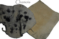
 I also used a Blue Tack, tortillion and a chamois.


This first tutorial is just to get some of the basic techniques I use for shading, blending and how to get a smooth texture. This "ball" exercise is a common one and I encourage you to practice it yourself to get these techniques down.
Shading tutorial

Here is a picture of the wedge tip that I use for most of the smooth textures I do.


I promise the video will get better and I will get these down to a much smaller length so the boredom doesn't take over!
Skip
Subscribe to:
Comments (Atom)